Website Design

Squarespace Designer Spotlight: In Your Face

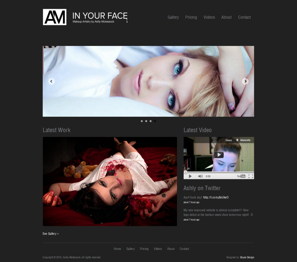
Squarespace Designer Spotlight: In Your FaceLately we've been publishing monthly installments of the Squarespace Website Show & Tell, a chance for designers on the Squarespace platform to show off their website creations. Last month's edition earned high praise for a handful of designers, one of which was Shane Boyce of GetBoyce.com. I asked Shane a few questions about his In Your Face website project, a portfolio site for for a makeup artist. Here's what Shane had to say about the project.

Why Did Your Client Pick Squarespace?

This particular client was a referral from a client that I built a website for earlier in the year. She went through her needs for the website and they fit really well with Squarespace, so it's what I recommended.

What was the #1 Goal for This Website and How Did You Achieve It?

The main goal for the website was to show and promote her work to prospective clients. So in an effort to show work, we used the Gallery module with several galleries - each representing a different category/style of work. We've also included a pricing page and a journal for videos.

Squarespace website gallery

What was Your Toughest Design Challenge and How Did You Overcome It?

Well, when Ashly went over her wishlist for the website, one of the things she mentioned was infusing it with her personality and interests. One of the genres she is interested in and works with is the Horror genre. If you take a look at her galleries, there's some really cool things she does with special effects makeup. So we decided this is what we wanted to try to include.

For me, this was a bit of a challenge because the website needed to be immediately attractive and engaging for the target market of professional people - they would be the market that would contract work. So after some brainstorming, my idea was borrowed from the video game and movie industries.

My idea was to think of some of the movies, shows, and video games in the zombie genre. A lot of them start with the main character waking up and not knowing where they are. They stumble into the world and find it almost normal, but not quite. As they move around, they find more and more that things are not as they appear.

Squarespace website header

I wanted to take this feeling and add that to the website. So when you go to it, it looks like a normal, clean, professional website, but as you navigate around, there's small things that appear. It's a fun and creative way to add Ashly's interests and personality into the website, while maintaining a professional look!

What was Your Favorite Part About Designing this Squarespace Website?

My favorite part was the creativity of the project. It's always fun when clients give us parameters that allow us to be very creative in solving the website's problems.

Is There a Quick Design Tip You Can Share with Readers That You Implemented on This Website

One of the things I'm asked about often is how to change the look of the forms. If you look at Ashly's website, I've rounded the corners and changed the background color to better match the website colors. You can alter the forms by targeting the CSS in Squarespace's Custom CSS. Here is the code I used in Ashly's website to make these changes to the standard form:

input, textarea { background-color: #CACACA; -moz-border-radius: 3px; -webkit-border-radius: 3px; border-radius: 3px; }

There's a lot you can do with CSS in your own websites to give forms more personality, you just have to try things out!

Squarespace contact form

A special thanks goes out to Shane Boyce for his knowledge and time. What do you like best about the In Your Face website? If you're a designer and want to be featured in next month's Squarespace Designer Show & Tell, find out how here.

Squarespace Website Show & Tell: March 2012

Squarespace Websites March Show & TellMarch's edition of the Squarespace Website Show & Tell features nine new Squarespace websites created by as many designers. This month there were two main themes: blogs and professional services websites -- you'll see Squarespace websites created for makeup artists, financial services professionals, community health centers, and more. Thank you to all the talented designers for submitting your work this month!

March's Squarespace Show & Tell

Take a look at this month's entires, then explore the Show & Tell archive. We have a growing list of Squarespace websites that may give you a little inspiration on your next project.

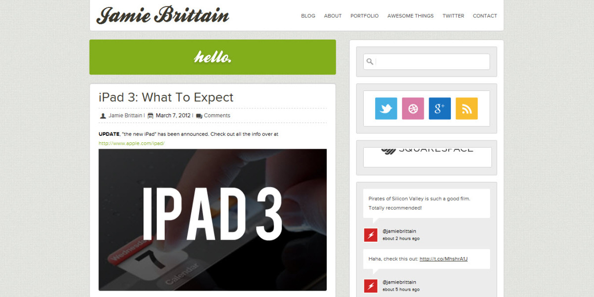
  • Jamie Brittain is a web designer, graphic designer and aspiring developer. He created his personal website and blog using Squarespace.
  • Ashly McKessock is a makeup artist looking to showcase her work and her knowledge of her craft. Our friend Shane Boyce created her new website, In Your Face.
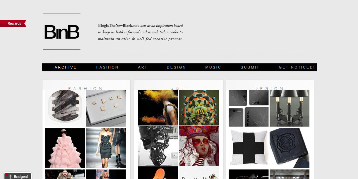
  • Hunter Cordell created Blog is the New Black, a blog about fashion, art, and design, among other things. I really liked Hunter's use of the fixed position navigation on the homepage of this Squarespace site.
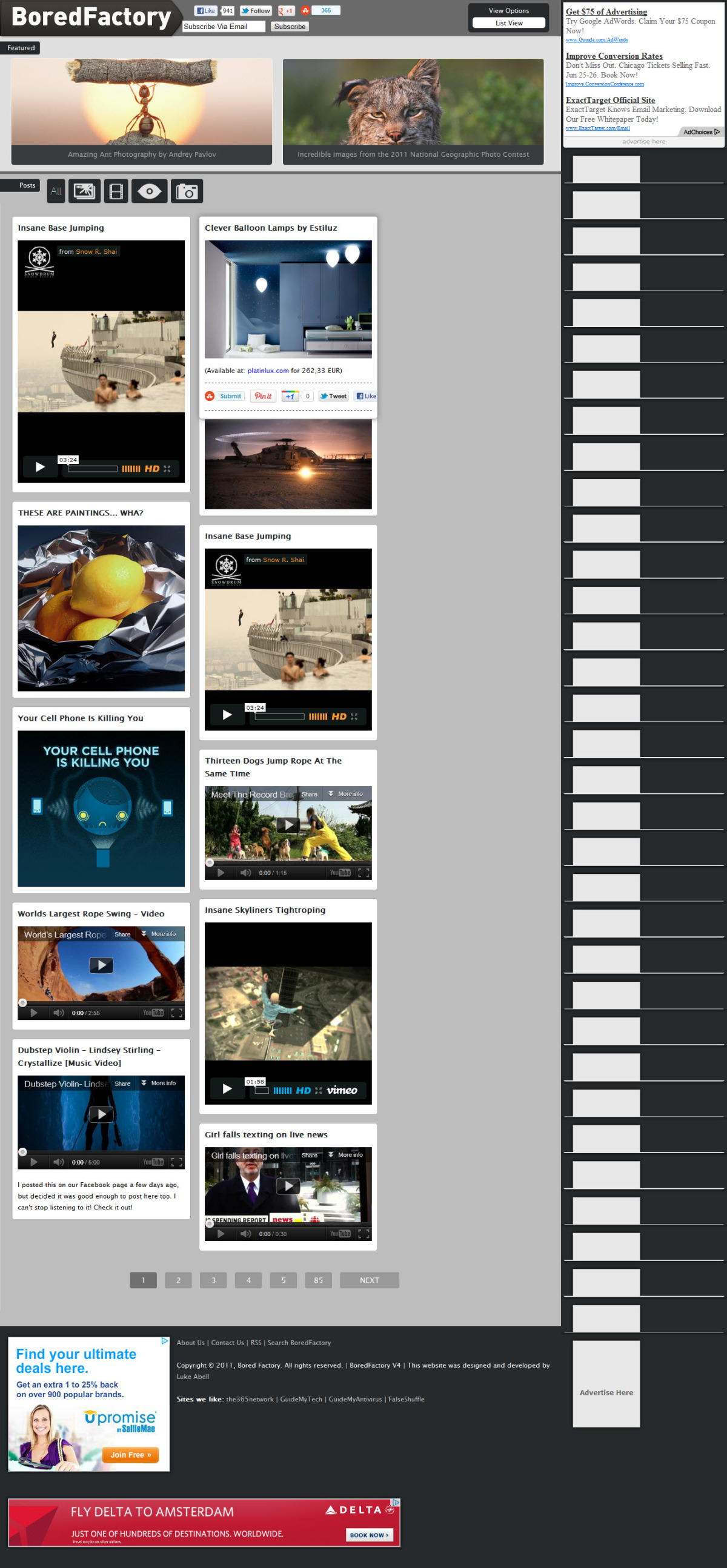
  • Bored Factory is a popular culture and entertainment blog created by Luke Abell of Abelltech.com.
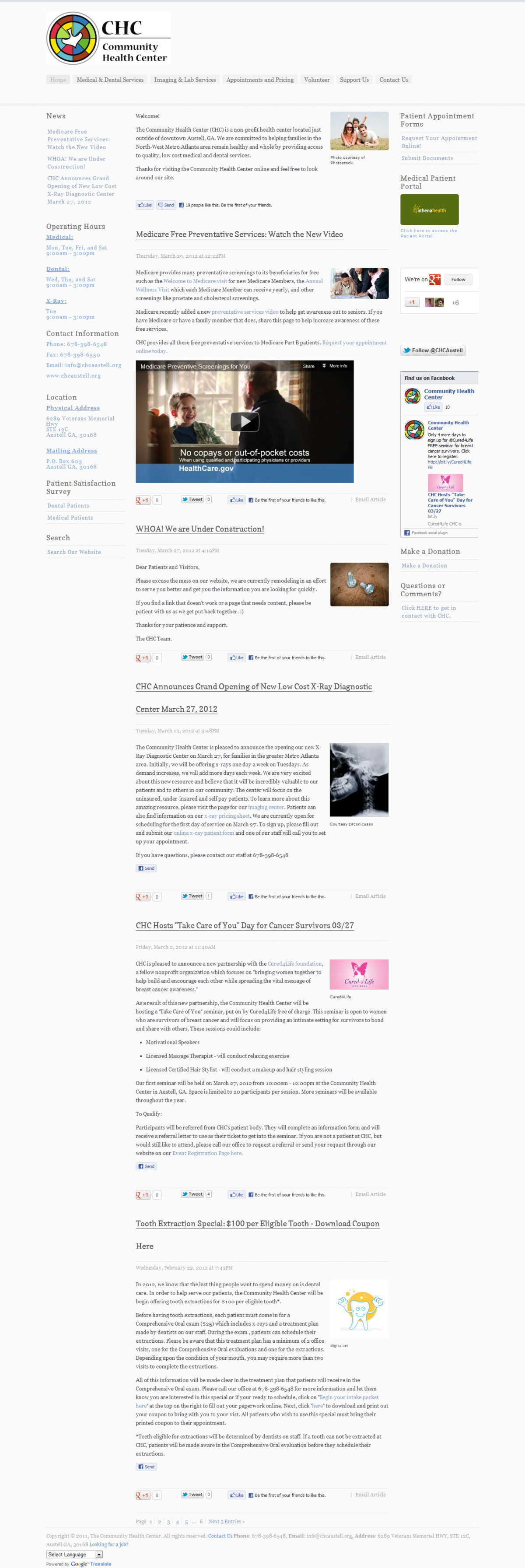
  • The Community Health Center of Austell, Georgia needed a website. Zach Aten of the CHC stepped up and built a website using Squarespace.
  • Dad in Prayer is a blog by Venezuelan father, blogger, and website developer, RJ Silva. 
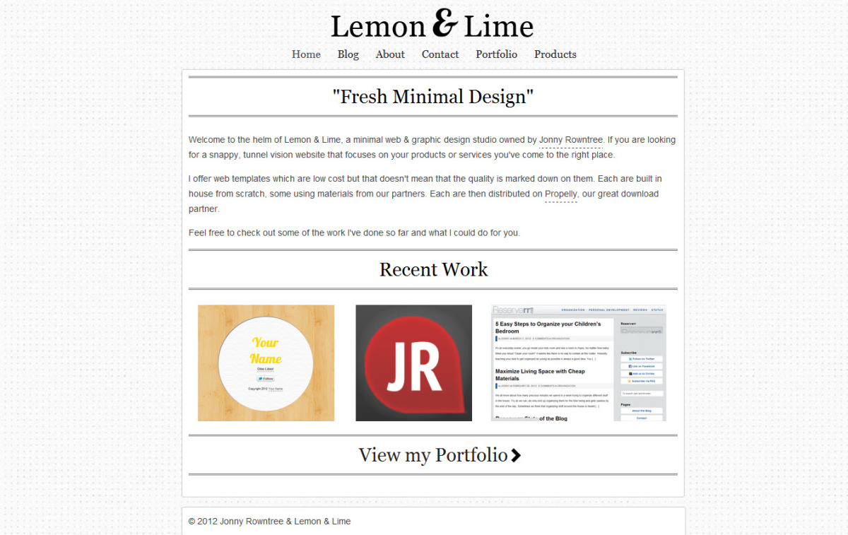
  • Jonny Rowntree is a UK-based blogger and website designer. Jonny studies IT in Newcastle, and builds Squarespace websites like Lemon and Li.me for fun when he's not studying.
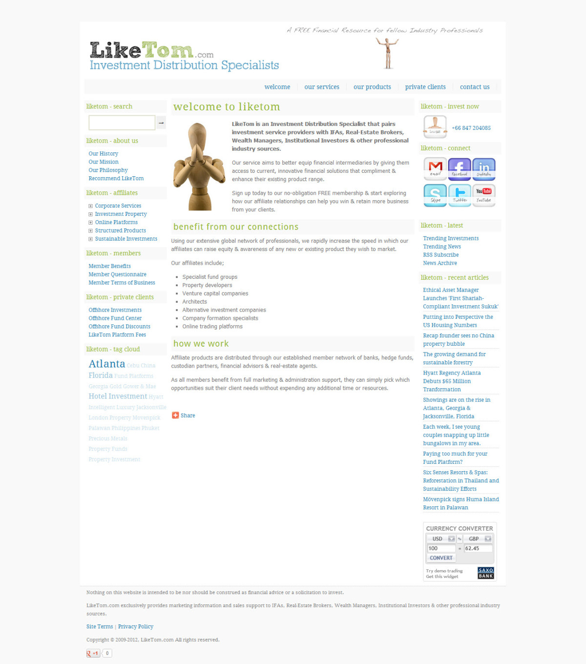
  • Like Tom is the investment resource website of Mark Sharman. 
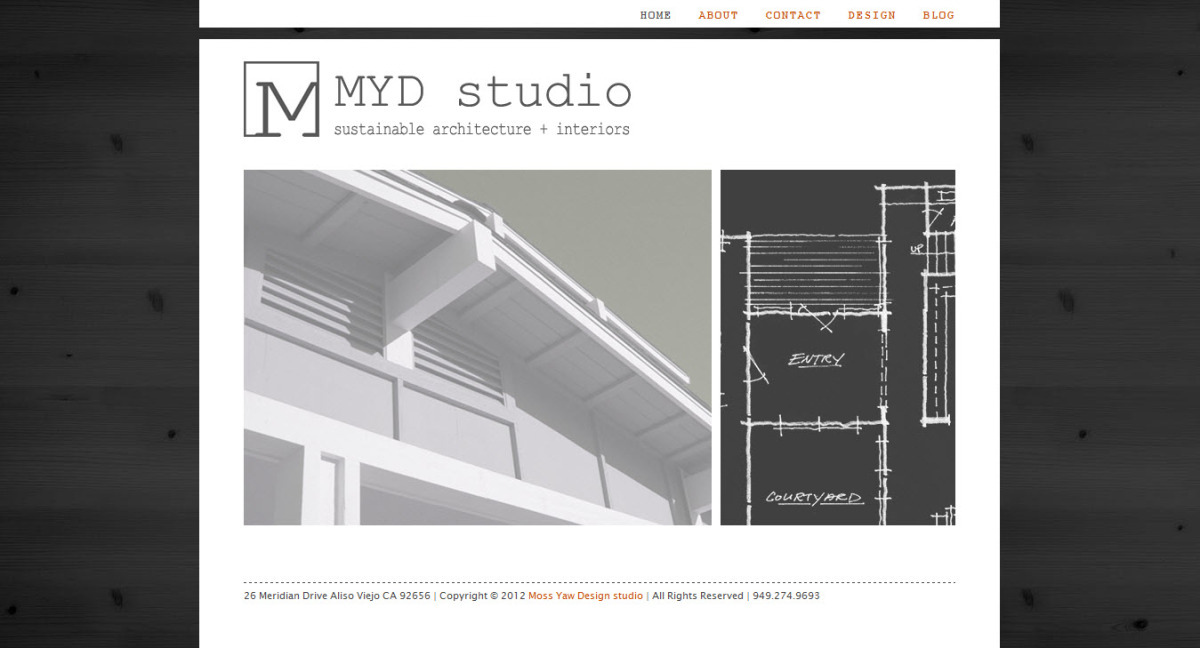
  • MYD Studio is a architecture company in southern California. U.C. Berkeley graduate and architect, Lauren Moss, created their website.

Show & Tell Your Squarespace Designs

There's nothing on the web as beautiful as a new Squarespace website. We really want to share your work with the Squarespace community and readers of the Big Picture Web Marketing blog. If you'd like to be featured, take a moment to fill out the submission form in the right column of this blog. The goal is to feature all website submitted each month. 

Squarespace Designer Spotlight: Pravassa

Squarespace website designers love seeing what other designers have created on the web publishing platform. That's what inspired the recent launch of the Squarespace Show and Tell, a monthly showcase of new Squarespace websites created by the designers and developers that read this blog. Today we sit down with a contributor, Alan Houser of Creative Component (and my co-host on the unofficial Squarespace podcast, Content, Structure & Style). Alan shares with us the recent experience of designing Pravassa.com.

Pravassa.com — a site by Creative Component

Why Did the Client Pick Squarespace for this Project?

Will open in new windowPrevious SiteThe client was already aware of Squarespace, and was happily using it for years. I think their previous site was set-up by a designer, because there were a few advanced tweaks to their blog I saw behind the scenes. But they were ready for a re-design.

What was the #1 Goal for This Website and How Did You Achieve this Objective?

The client's goal was primarily to re-organize their content and make it easier for visitors to find what they're looking for. They were using their previous site's blog for everything— new vacation listings, company news, specials and more. On Squarespace, it's quite possible to use one journal for all things, then to filter the appropriate content areas using Categories, there's a trade-off when it comes to keep things from getting cluttered.

The first step was to create a journal for each major "department". We considered internal News as its own department, then each of the following areas were segmented out on their own: Management, Staff, Products, Tips, Reviews, Press, etc. In all, there are ten journals on Pravassa.com. Only a few of them are styled as a blog, and the rest exist to better-manage posts and product lists.

What was Your Toughest Design Challenge for This Website and How Did You Overcome It?

The client specified that I build a graphical slider consisting of images from various posts, with post titles on roll-over and links to each respective post when clicked. To pull this off, we built the component using jQuery, JSON, HTML & CSS. A few points that were immediately obvious were:
1. The client would need to maintain the feature going-forward— managing it with no advanced HTML knowledge was a must.
2. Not every post will show-up. There must be a way to select the image to send it to the slider.

In non-technical terms, the client will make a post, then will upload a small image within the post, then assign a CSS class to the image. That's all they need to do. The small image isn't visible within the journal itself, and by adding this "alt" image, everything will just happen for them.

The next challenge to arise was the request that nine of the ten journals on the site would need to feed the slider. The solution I turned to was Yahoo Pipes— to combine all feeds into one. Crisis averted & calm-enhanced (it is a Yoga site, after all).

What was Your Favorite Part About Designing this Squarespace Website?

With every site I build I have the most fun when solving problems with simple solutions. If the solution lies within Squarespace— and maybe I have to hack some code behind the curtain to pull it off— if the client can maintain the site using standard Squarespace editing tools, then everyone's happy.

On the Vacation Pages, How Did You Add that Secondary Menu? (link)

On the site's Vacation pages, it was important to design a tabbed concept that would be functional. At the very least, "functional" should read 'easy to navigate' by a site visitor. Nice-to-haves would be: 'easy to manage' and 'should index well in search engines'. I was going back & forth between using separate pages -or- implementing a javascript solution to the one page that would show/hide content. I leaned towards building separate pages for each section.

This would make editing page content easier (using WYSIWYG) and creating new pages would be easier, since that functionality is built into Squarespace. From a usability perspective, the client now has stacks of pages that they can submit to prospective clients and on Twitter/Facebook. Additionally, extra linked pages with their own heading/content relationships will perform like a dream on search engines.

So basically, each Vacation's landing page is a journal post and all other sub-pages are stored in a hidden section. Then across the top of each page, lies the navigation bar to jump-between the group's pages.

Is There a Quick Design Tip You Can Share with Readers That You Implemented on This Website?

Sure! I added a little CSS magic to images that appear in a journal. You'll see how they have rounded corners, and a slight drop-shadow. This effect only appears on the page if the image is left or right aligned, using the built-in WYSIWYG editor. If the client doesn't want the effect on an image, they would select "inline" or "block" alignment within the editor.

Here's the CSS used for this (below). The rounded corners won't appear in some versions of IE, but they will in every great browser. (Ya, I said it.)

/***** Image Treatment throughout site - Adding Radius *****/

.full-image-float-left img, .full-image-float-right img { overflow: hidden; -moz-border-radius: 4px; -webkit-border-radius: 4px; border-radius: 4px; -moz-box-shadow: 0 12px 8px -6px #999; -webkit-box-shadow: 0 12px 8px -6px #999; box-shadow: 0 12px 8px -6px #999; }
.full-image-float-left .thumbnail-caption, .full-image-float-right .thumbnail-caption { padding-left: 6px; }
.full-image-float-right { margin: 5px 5px 10px 15px; clear: right; }
.full-image-float-left { margin: 5px 15px 10px 5px; clear: left; }


Submit your recently designed Squarespace websites to the monthly Show and Tell by filling out the form in the Squarespace Resources section of the blog navigation. Special thanks to Alan Houser for sharing his talent and expertise!