Website Design

Squarespace 6: the Web's Next Big Publishing Platform is Here

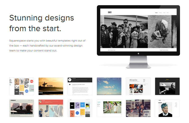
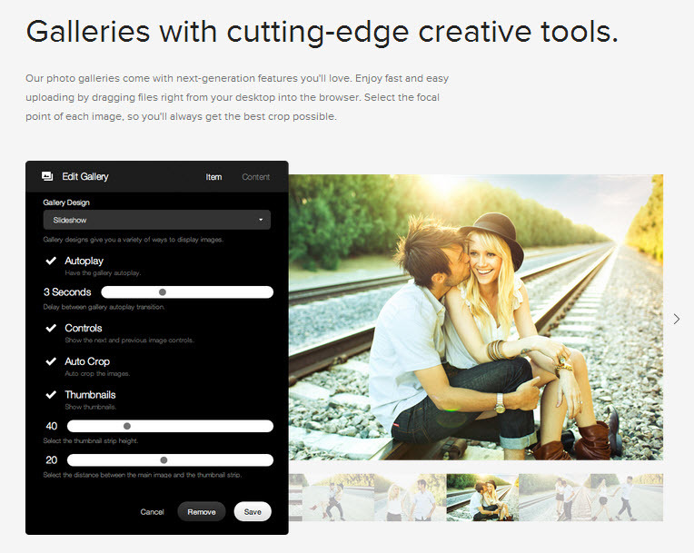
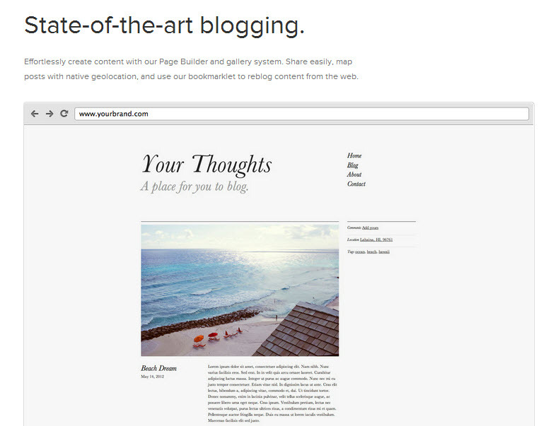
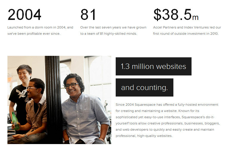
Squarespace 6 released on 7/17After years of development, Squarespace 6 is finally here. The company announced their revolutionary new web publishing platform last week, which empowers anyone to build a high-quality website or blog with greater ease than ever before.

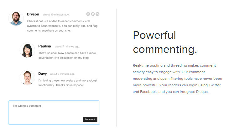
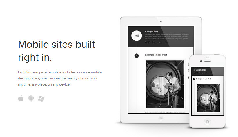
50 new features paired with cutting-edge web design technology like HTML5 and CSS3 position Squarespace 6 as a serious future contender in the website/blog building space. And if you take a look at their long-term plan, it's not hard to see why some think Squarespace 6 may even be poised to take on Wordpress.

Squarespace 6: An Interesting Hybrid Between Two Worlds

Squarespace CEO and founder Anthony Casalena recently gave TechCrunch a look into his long-term strategy for Squarespace 6. He calls it, "an interesting hybrid between two worlds." Squarespace 6 is a product that is made for both developers and consumers.

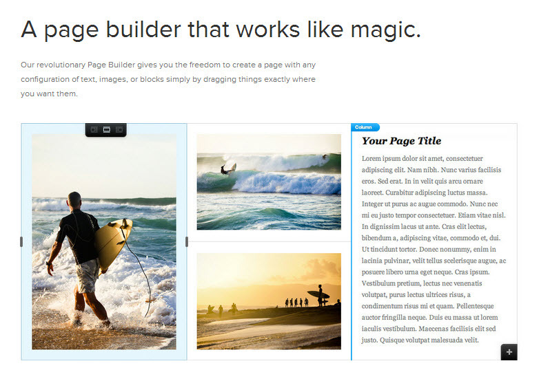
Web publishing on Squarespace 6Developers have access to a highly complex and customizable layer of Squarespace 6, while end-users are greeted with an intuitive and simple set of tools to facilitate everyday web building tasks. "We think of it as kind of a first," he said.

And Tuesday's announcement was just the beginning. The $38.5 M in funding Squarespace received back in 2010 not only allowed them to build what they released last week in Squarespace 6, but also set the stage for the evolution of the product into the future.

"[The investment] set the company on a trajectory to go for what we wanted to make, which was stuff like this platform, and a lot of other things we can't talk about right now but will come out on the heels of this platform." - Squarespace founder Anthony Casalena

Squarespace 6 will likely evolve quickly and through the help of the highly talented pool of Squarespace designer/developer enthusiasts. And the company itself hints at frequent feature releases and powerful new features such as ecommerce on the horizon

Squarespace 5 vs. Squarespace 6

Squarespace v5 has served its users well for a half a decade, but it started to feel like an eternity in Internet years to its passionate customer base. Squarespace 6 will no doubt soothe the masses who have been frothy for the new platform since first getting a taste of the beta program last year. 

Squarespace 6 is completely different from version 5. Existing customers will need to build a new website on Squarespace 6 and then shut down their current v5 site. There are pretty decent import tools in Squarespace 6, but the products really are too different to map things over one-to-one. 

At first glance, this might strike some as inconvenient. Not me though. I'm using the transition as an opportunity to clean up my website content and prune some sections that are currently just adding clutter. A streamlined site and the new structure and benefits of Squarespace 6 will make the effort of migration worthwhile. 

Hanging Out and Talking Squarespace 6

Hangout and talk about Squarespace 6Are you a current customer of Squarespace using v5 and looking to transition? Are you looking to builld a new website and Squarespace 6 caught your eye? Hang out with Squarespace experts and novices alike on Tuesday, July 31 at 6:45pm CDT for Big Picture Web's Hanging Out and Talking Squarespace through a Google+ Hangout. (Space is extremely limited so register now if you'd like to be a part of the event.)

Have you tried Squarespace 6? What features do you like so far? If you're still waiting to try the new version of Squarespace, what features are important to you in a new web publishing platform? Share your thoughts with me.

Getting Your Message Right with Your Customer

Are you a good fit for your customers? The right customer can make you more successful and help you enjoy doing what you do even more. Take Alan Houser, for example.

Focus Your Message

Alan is a Squarespace designer, media maker, and friend of mine. He redesigned his site this week to hyper-focus his message to only potential clients who want a beautiful website created specifically for them that they can then manage on their own. The new home page video illustrates this message perfectly:

Be the Hedgehog?

In business, the goal is often just to make a profit. But great companies travel Alan's path by saying no to the wrong type of work and focusing instead on the one thing they do the best. This was dubbed the "Hedgehog Concept" in Good to Great by Jim Collins. Put it this way:

“A great company is more likely to die of indigestion from too much opportunity than starvation from too little.” - Packard's Law

If great companies can do this, so can great people. 

Think about this quote as you do your work today. Are you doing what you can to focus on what you do best or are you experiencing some indigestion right now?

P.S. Make sure you give @AlanHouser a shout on Twitter and tell him what you think of his new site.

Squarespace Website Show & Tell: June 2012

June Squarespace Website Show & TellIt's time for the June Squarespace Website Show & Tell! Each month we call out to all Squarespace designers are ask for their latest work in an effort to help showcase the talent in the community and to inspire you in your own web design endeavors.

Learn from and enjoy their work, and don't forget to submit your work for July's Show & Tell.

June Squarespace Website Show & Tell

We had eight brand spankin' new websites submitted by seven excellent designers in the Squarespace community during the month of June. 

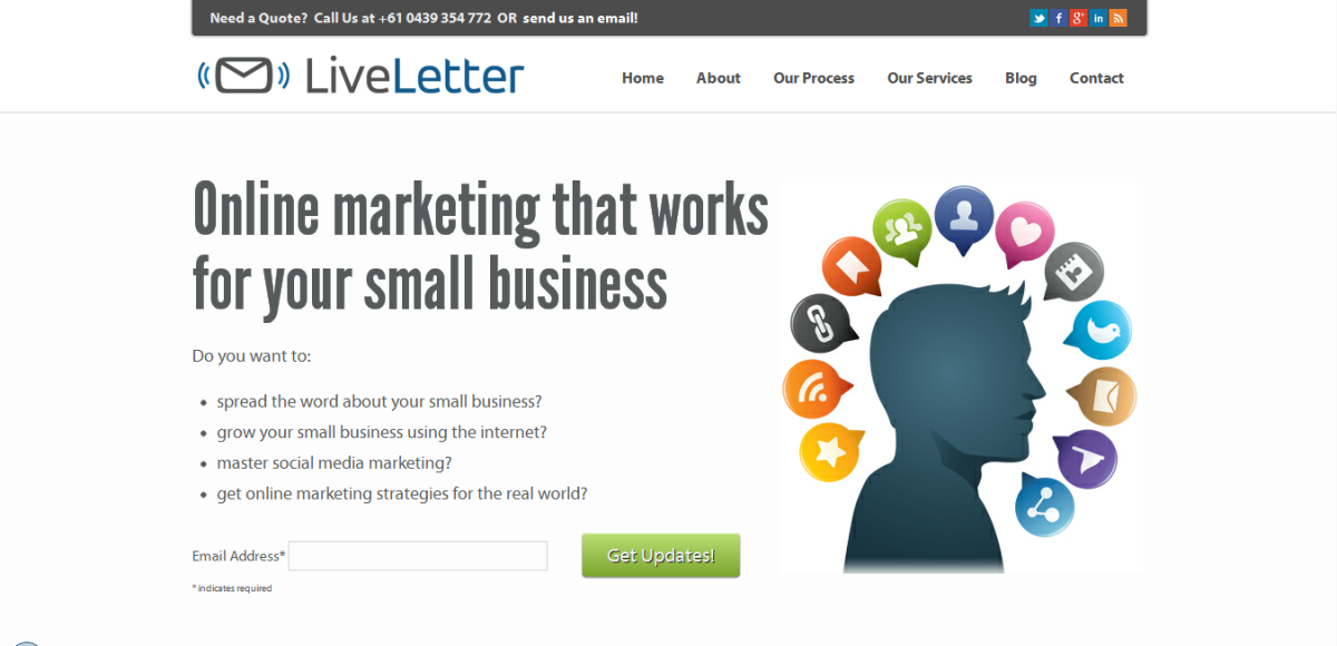
  • LiveLetter is an online marketing company with a great lead generation website created by our friend and frequent contributor to the Show & Tell, Shane Boyce of Boyce Design.
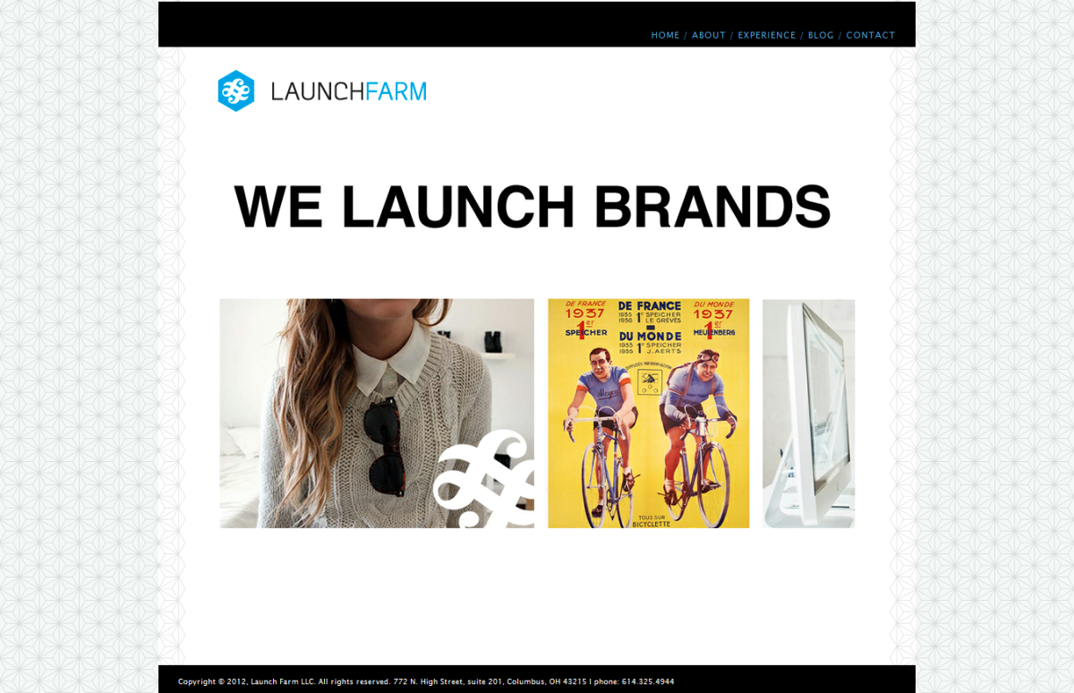
  • Launch Farm is a boutique branding agency out of Ohio that helps brands cultivate and curate content and with social media. Founder and Principal Christian Deuber submitted his site to us.
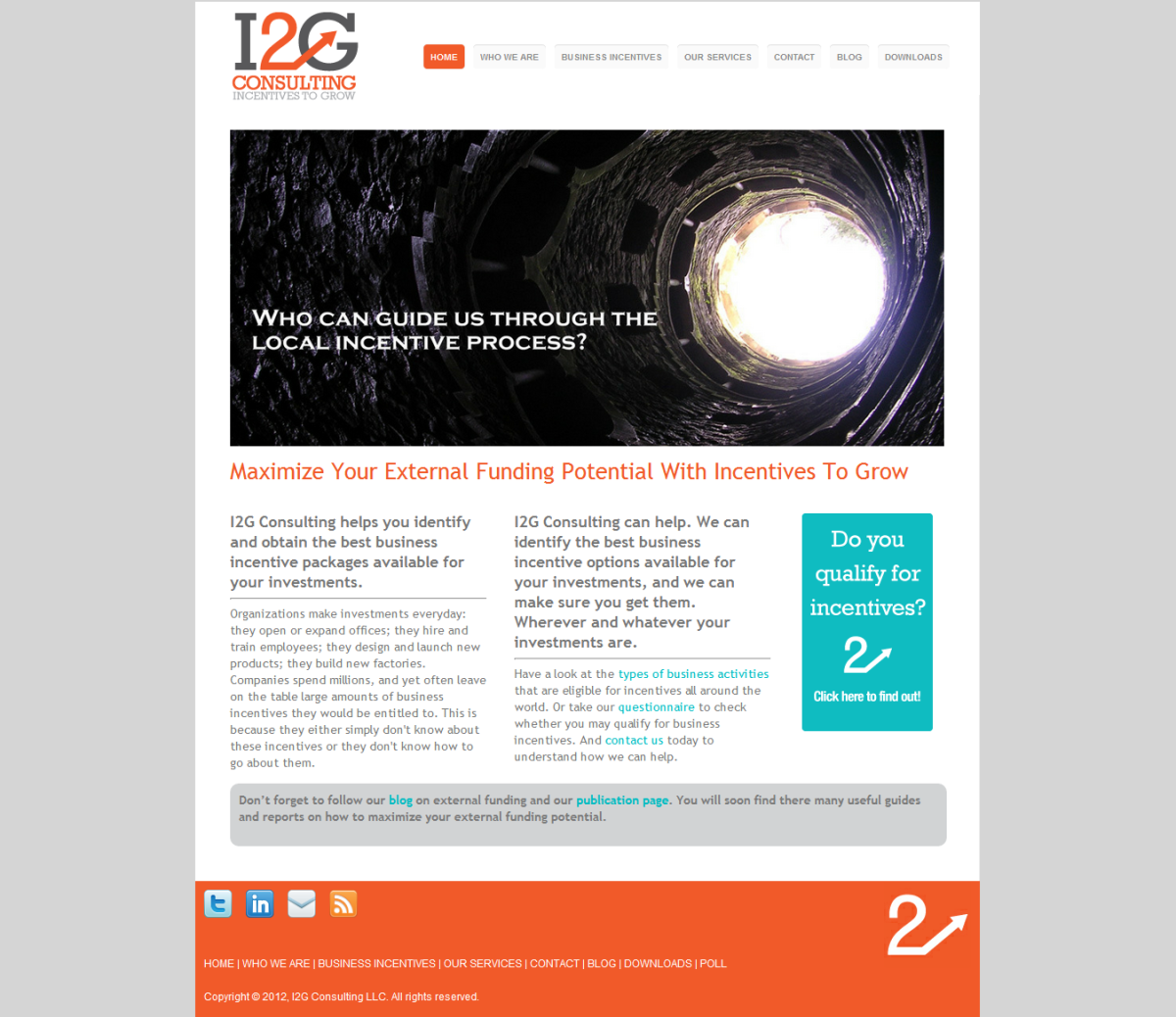
  • Incentives to Grow Consulting asked our friend Tony Ham to build a new home for their brand online. He built this beaut of a site for them.
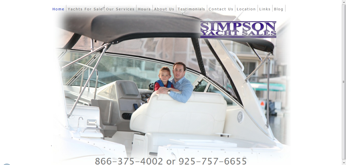
  • Simpson Yacht Sales is a small business website in the business of selling yachts. Owner Chris Simpson is an entrepreneur who found a great web platform in Squarespace to meet the needs of his growing business.
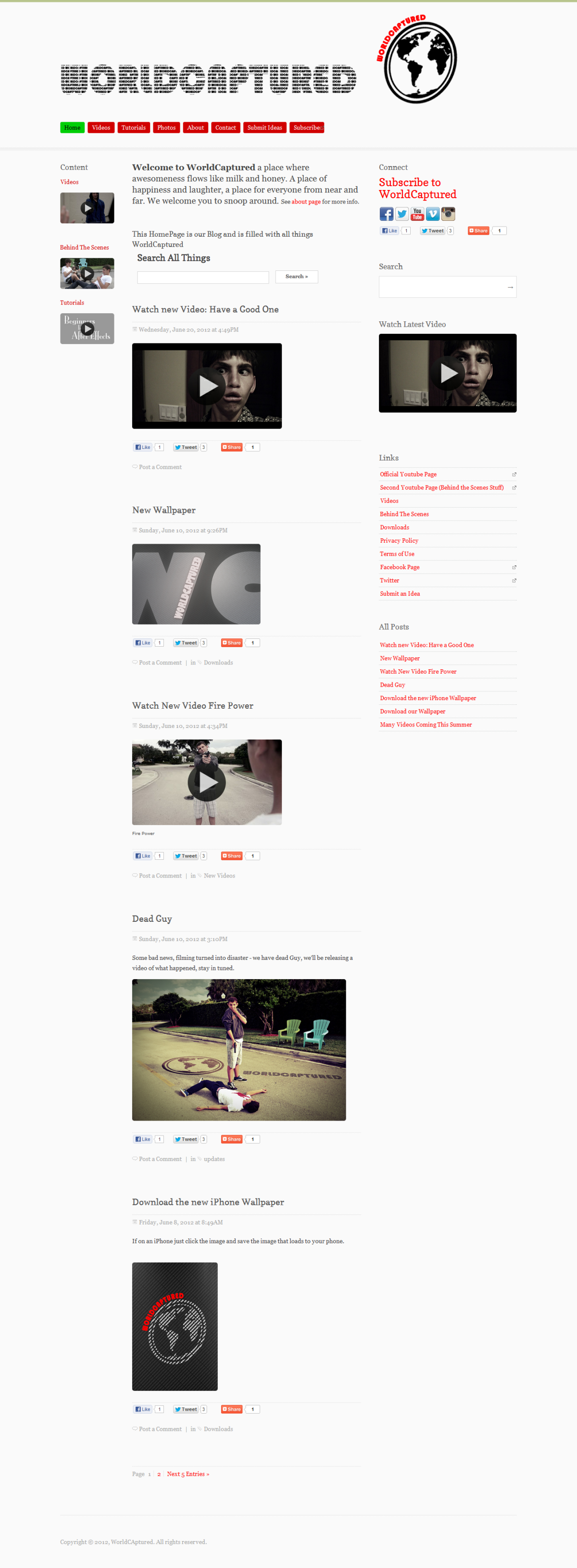
  • WorldCaptured is a group of young adults who built their website to showcase their work in entertainment, photography, and filmmaking. Group founder Jordan Stauber is also their web designer.
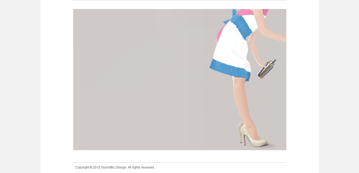
  • Stuart Smith is an LA-based designer from the UK who also happens to be a senior designer for Disney Publishing Worldwide
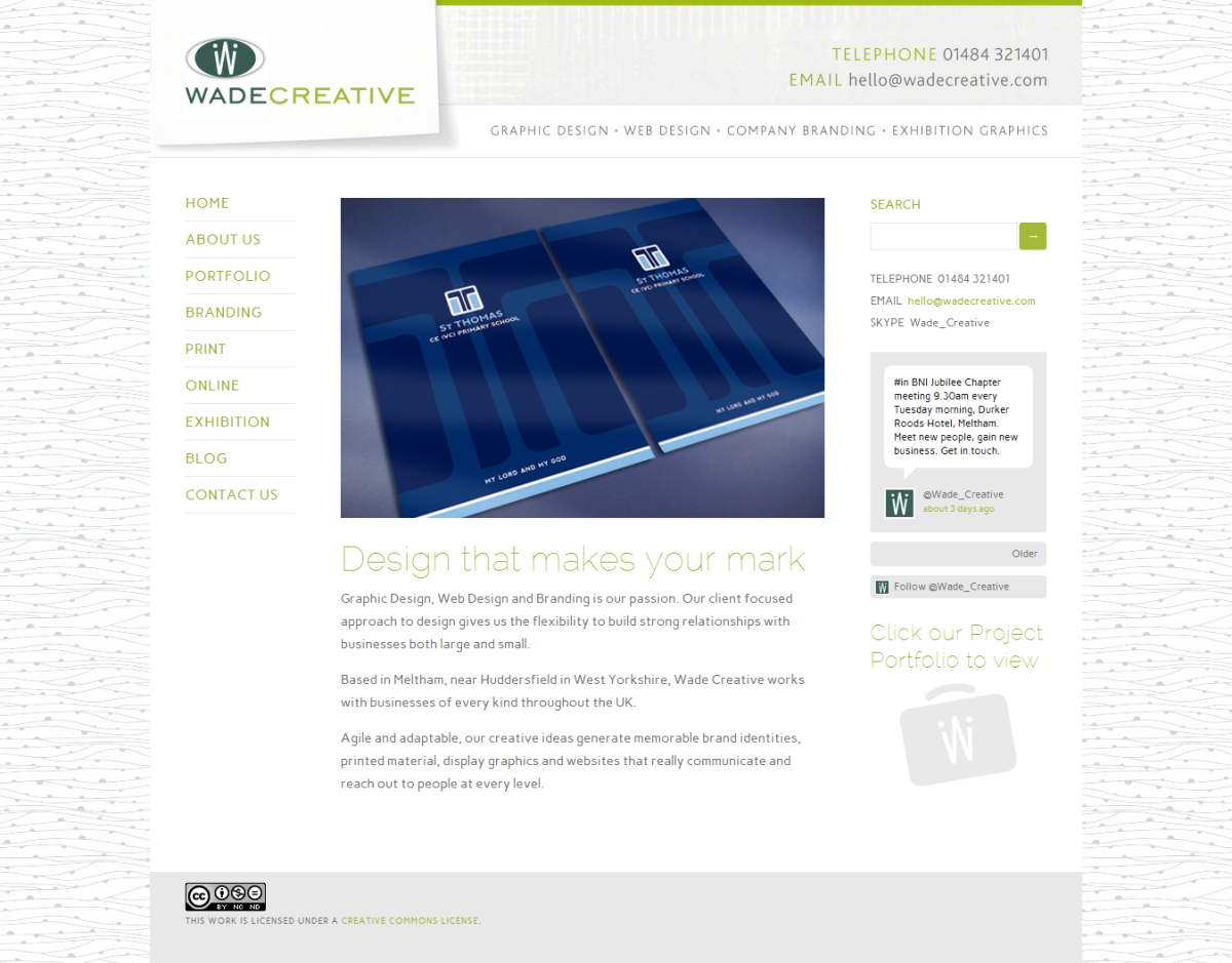
  • Wade Creative is the brand of graphic and web designer and branding professional Steve Wade. Check out the great look of his Squarespace website.
  • BloodHub marks the first an only company that specializes in the recruitment, collections, manufacturing and testing of blood. Shane Boyce of Boyce Design submits this unique specimen this month.

Which is your favorite website from the month and what do you like about it? Or, is there a feature of a particular website that you want to know how to create? Leave your comments below, and make sure to submit your work for July's Show & Tell by filling out the form on the right side of the blog. 

(Don't have Squarepace website yet? Check out this review.)

Is the Squarespace 6 Release Right Around the Corner?

Squarespace 6 Release is NearAn official Squarespace 6 company website was spotted out in the wild this week, listing the pricing and features of the new platform, and proclaiming that the beta is now over and that Squarespace 6 is being readied for customers. Has the long wait finally come to an end? Is the Squarespace 6 release right around the corner?

As I was getting ready to fire up this week's post, my eye was drawn to a tweet by Squarespacer Hamish Prior from Melbourne, Australia: 

Curious, I clicked, and found what looks like what will be the Squarespace.com homepage when Squarespace 6 is released. Evidently, it looks like things are going to happen soon. If Hamish's tweet is an indication of things to come, Squarespace 6 is coming soon, and it will include some amazing new features.

What do you think? Will the new features be worth the wait or has Squarespace missed their window to really impress current and new customers with the release of Squarespace 6?

Squarespace Website Show & Tell: April 2012

squarespace websites april 2012One of the things I love the most about Squarespace websites is that rarely do you find two that look exactly the same, especially after a professional designer has had a hand in the design. This month's Show & Tell features ten uniquely beautiful websites created by six friends of our blog. Check out websites ranging from sites for consultants to heavy metal record labels. Vote for your favorite submitted design to crown this month's champ.

April's Squarespace Show & Tell

Squarespace offers some pretty great templates, but you can't compete with the polished and completely branded look of a custom site. Take a gander at these ten very unique websites.

  • Big Blue Dahab is a PADI dive resort in the Red Sea. They asked Allie Astell of Manage My Website to create their beautiful Squarespace website.
  • Campbell Salgado Studio is a senior portrait photography studio formed through the love and partnership of Kim Campell and Francisco Salgado. In addition to being a very talented photographer, Kim also happens to be their web designer.
  • Terry Pappy created a website for Cambridge Performance Partners, a website for a business improvement consultancy. More of Terry's work can be found at Better3.
  • Terry Pappy's second submission for the month is an informational website created to support the Compass Playbook, a guide that promises to create breakthrough success through creating clarity around the things that matter to you.
  • Terry Pappy had a busy month in April, submitting three sites to this month's Show & TellGoonan Performance Strategies are healthcare business consultants based in Massachusetts. 
  • My pal and owner of Creative Component, Alan Houser, submitted a gem of a site in Eonian Records, the online presence of a metal music label by the same name. I thought this Squarespace website rocked hard!
  • Alan Houser's second website for the month of April was for San Francisco Real Estate Agency, Proximty Real Estate. They're no doubt loving the clean and effective website Alan built for them.
  • Some of my favorite websites are for individuals looking to showcase their personal brands. Security and Technology expert Todd Morris turned to Alan Houser and Creative Component to create his online presence. I really like how Alan made it easy to learn about Todd and connect with him all across the web.
  • Michael Bessig of Bite47 and Altendorf, Switzerland, submitted a portfolio website that showcases Sarina Arnold, a Swiss model who has graced the cover of such magazines as Vogue and Elle.
  • Last but not least, Tech Terrier is a tech blog created and managed by Alex Lightman. Check out their coverage of the ODOC iPhone docking station to get a sense of the cool stuff Alex and his writers cover over there.

What was your favorite website in the Squarespace Show & Tell this month? Be sure to share your thoughts in the comments or in our poll on our Facebook page We'll interview the designer you think submitted the hottest design. Also, if you're looking for futher inspiration, check out our Show & Tell archives. And if you need help with your site, don't forget about our Squarespace Designer Directory.